DIVIDENDS
Let’s face it. It’s time to invest in yours. We work out, eat right, and now it's time to show up for our skin. DIVIDENDS biology-based skincare is engineered for men who value long-term returns.
Strategy
New habits are hard. Whether it's eating better or building wealth, meaningful change takes real commitment. DIVIDENDS believe that every good choice compounds, leading to lasting impact. This became the basis for the strategic idea behind the brand. The ‘infinite effect’ of good wellbeing choices.
Logo
The logo embodies repetition and routine, while also symbolising compounded growth over time, a visual expression of the brand’s core idea. It features a wordmarque and an icon that can be used together or independently, offering versatility and adaptability across brand touchpoints.
Many skincare brands embrace a minimal, stylish aesthetic in their packaging. For DIVIDENDS, the challenge was to create a design that felt both distinctive and true to the brand’s ethos.
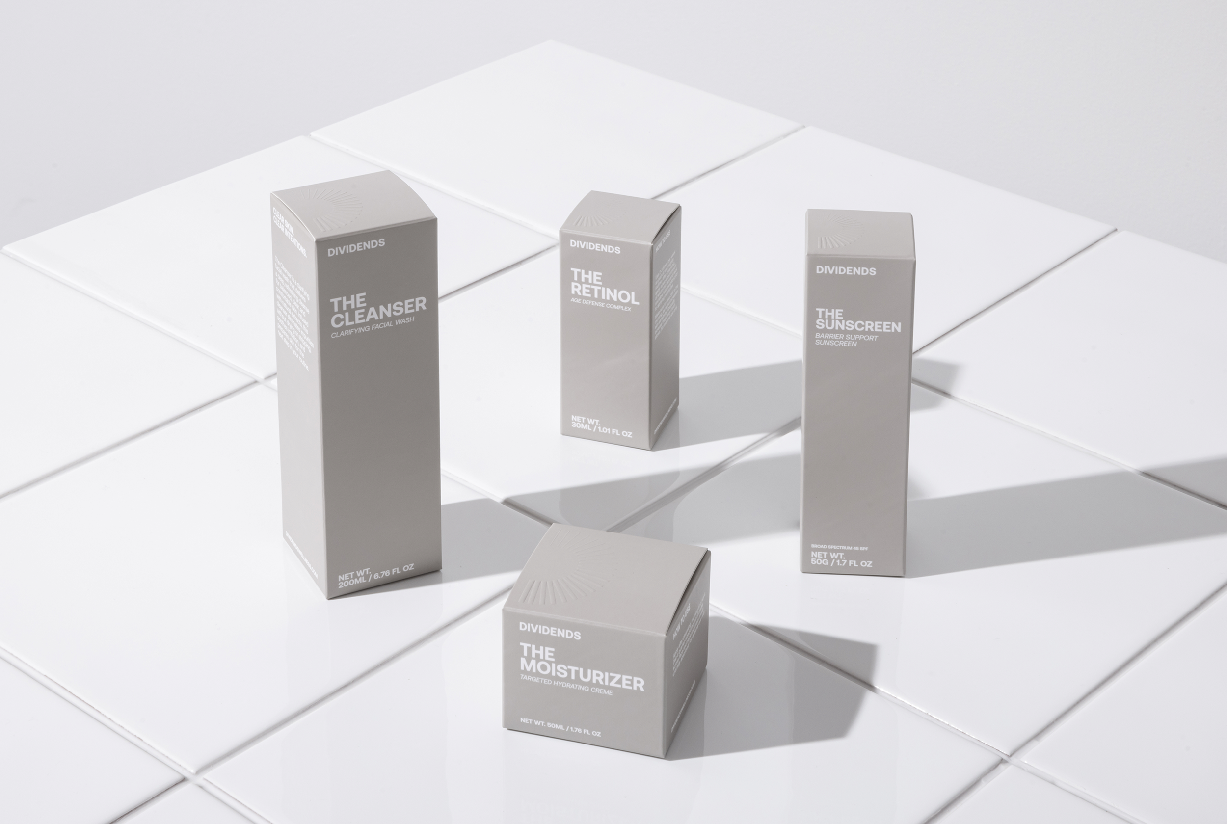
Packaging
DIVIDENDS creates high-end, research-based products, a principle reflected in the packaging design. Technical line work, growing from a single point and expanding with each new section, reflects the brand’s strategic focus. Colour is used intentionally to create tension and contrast throughout the packaging process, shifting from light to dark, and vice versa.
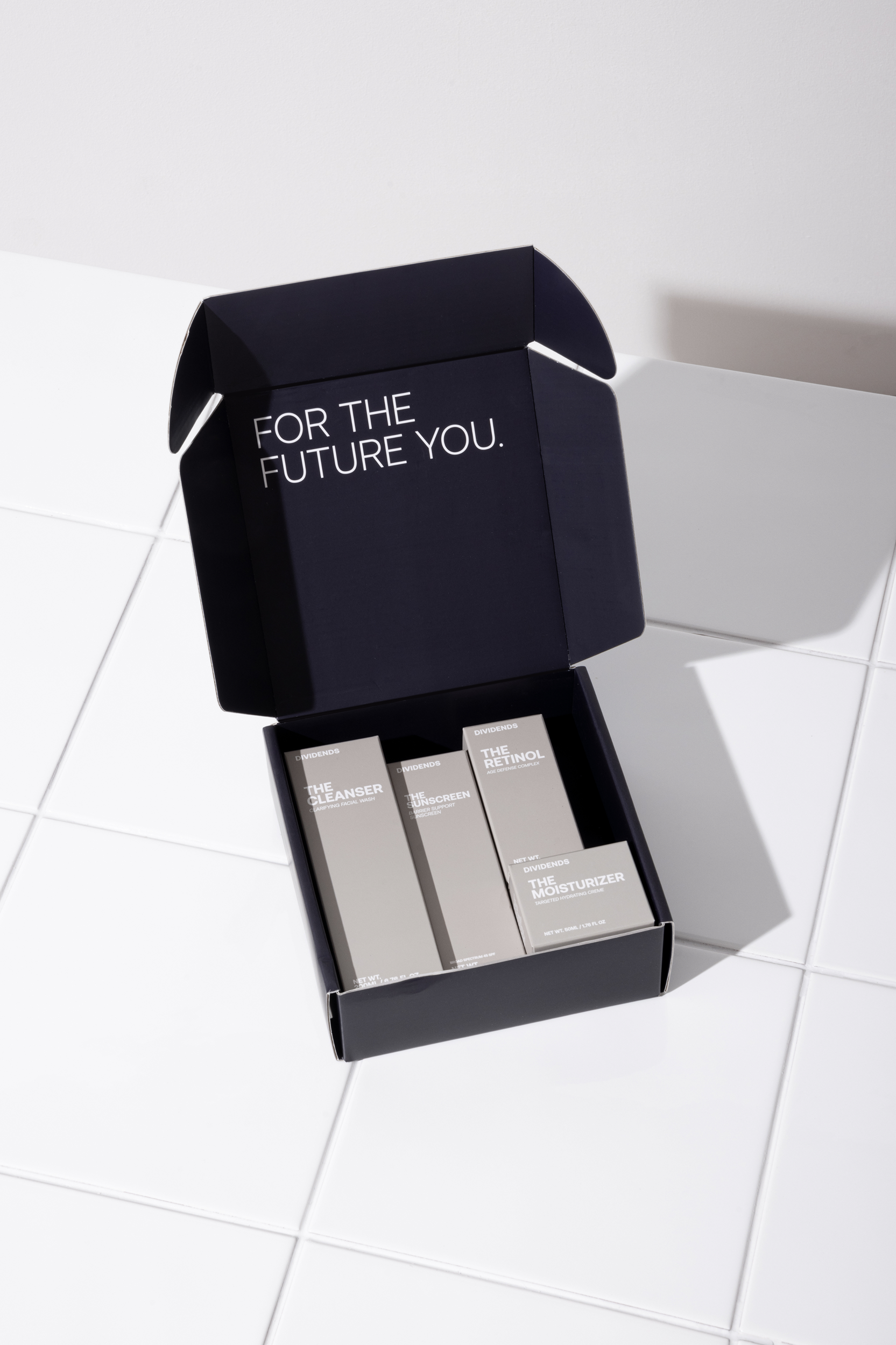


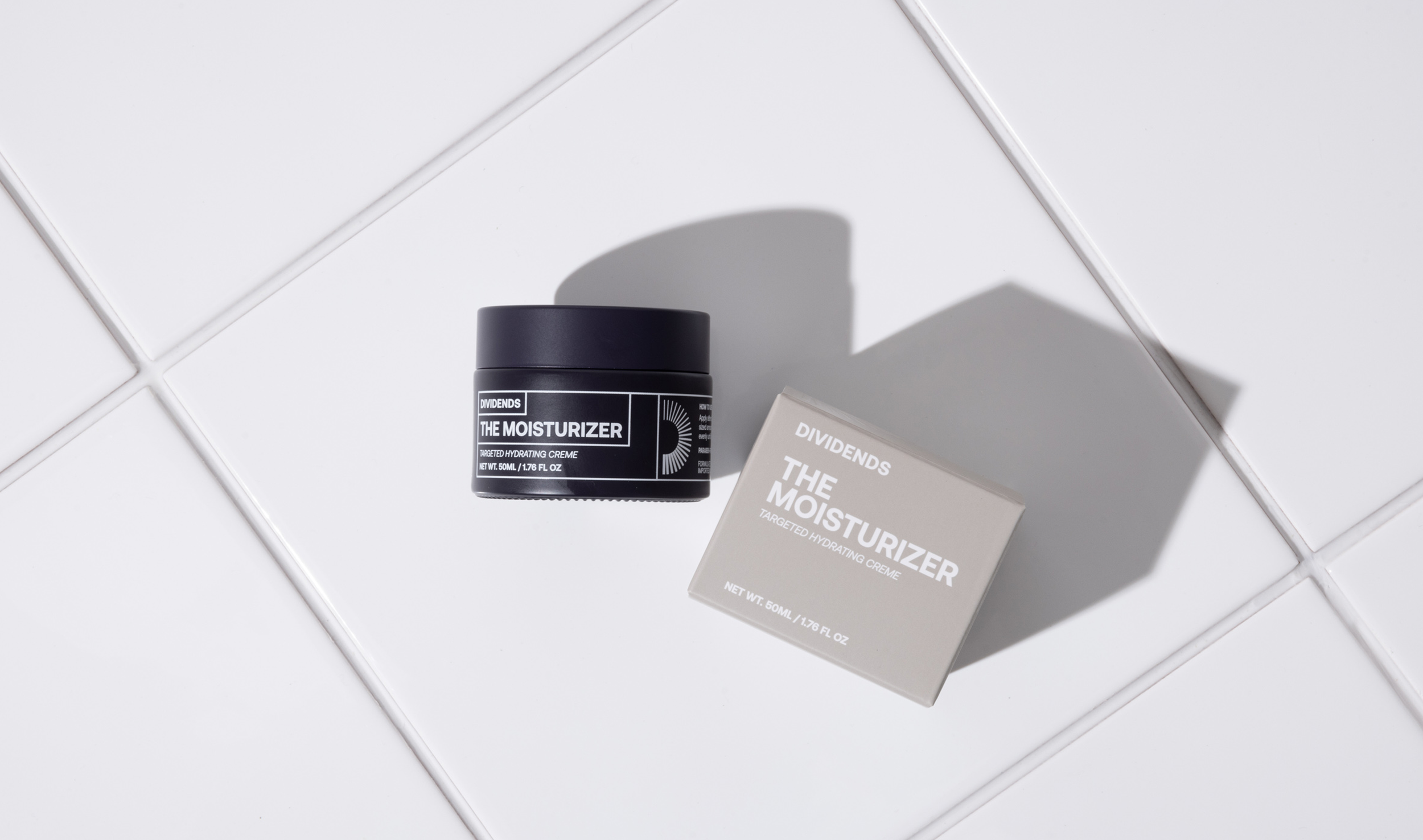
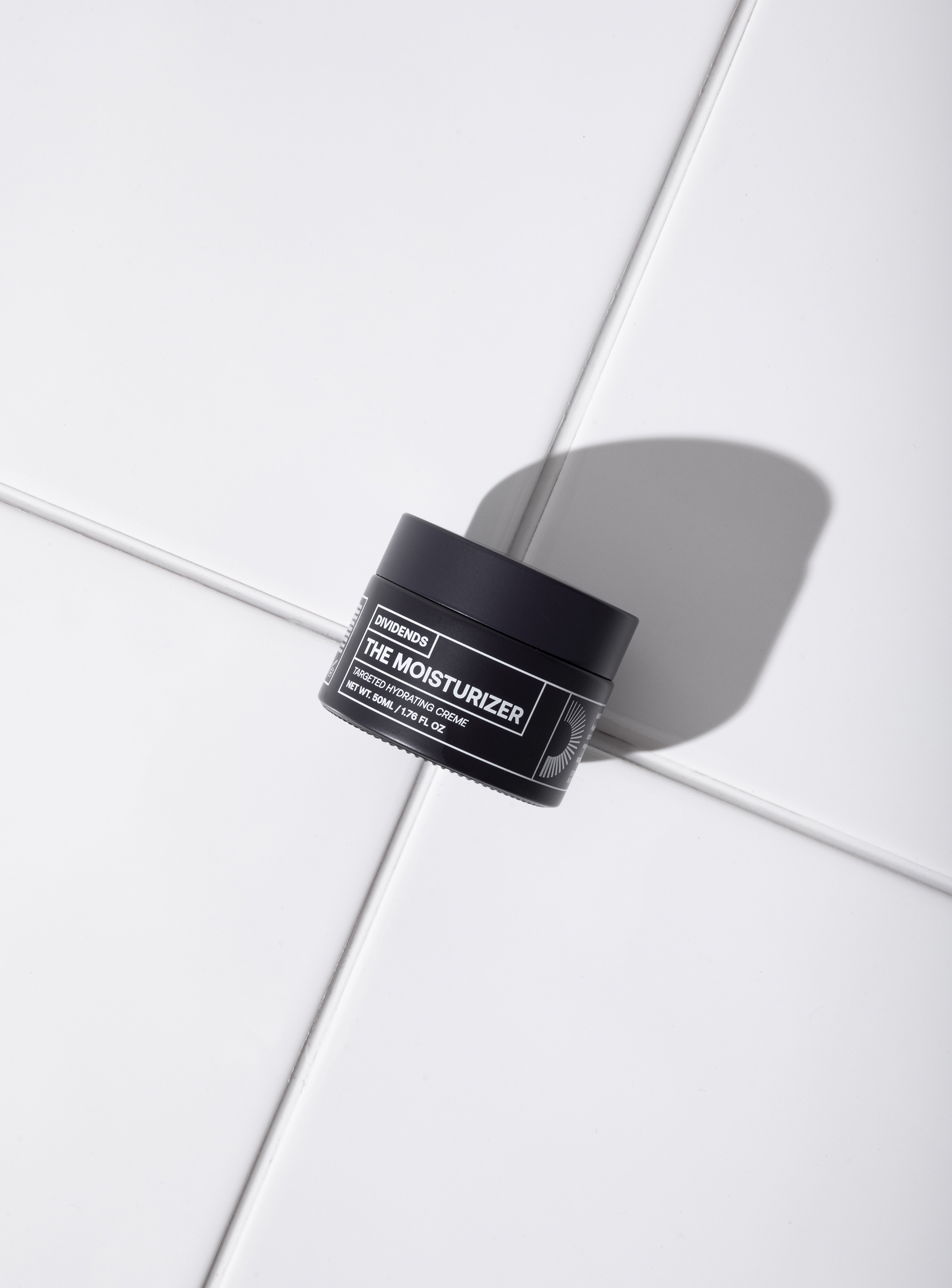
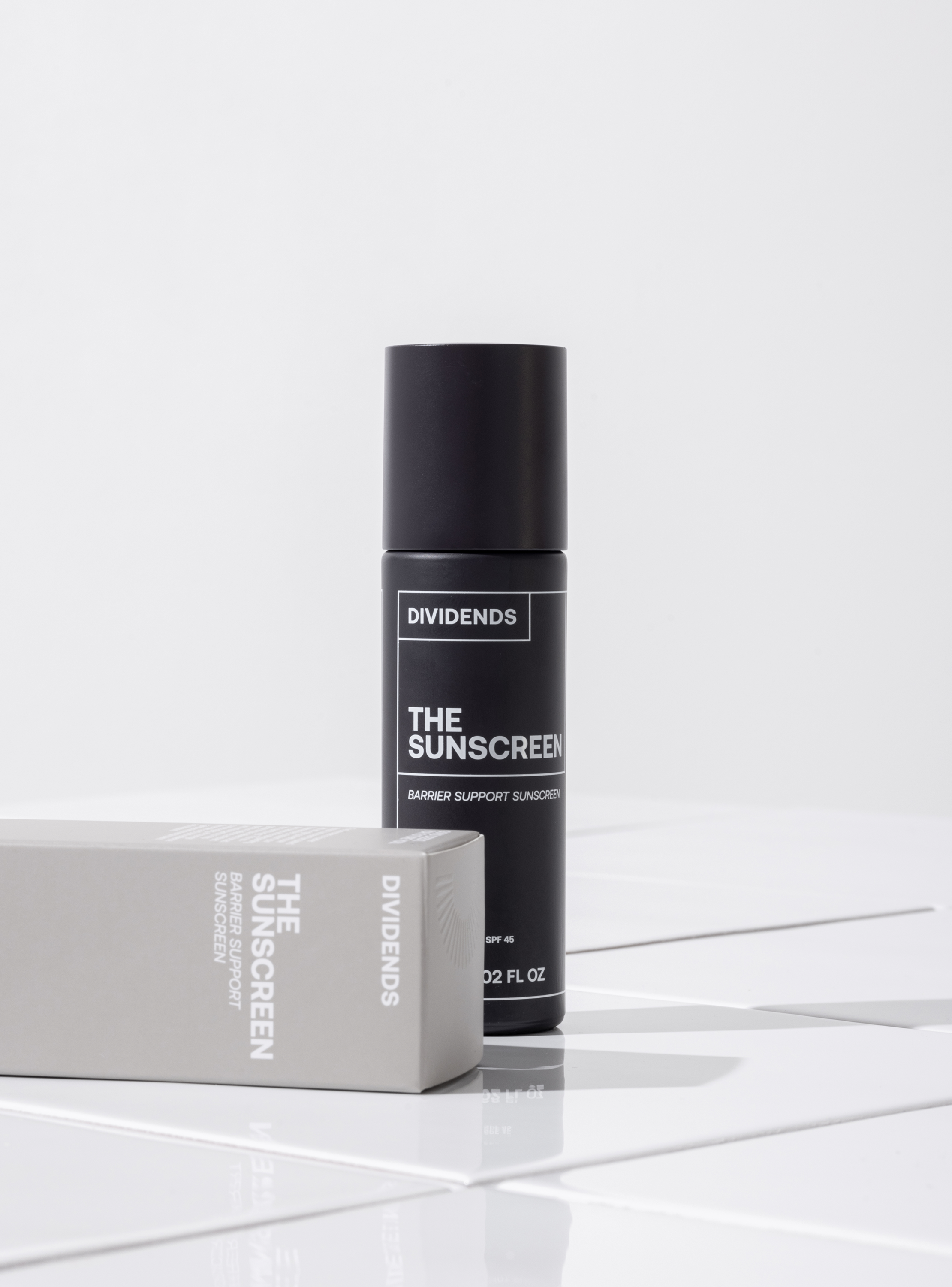
Packaging photography
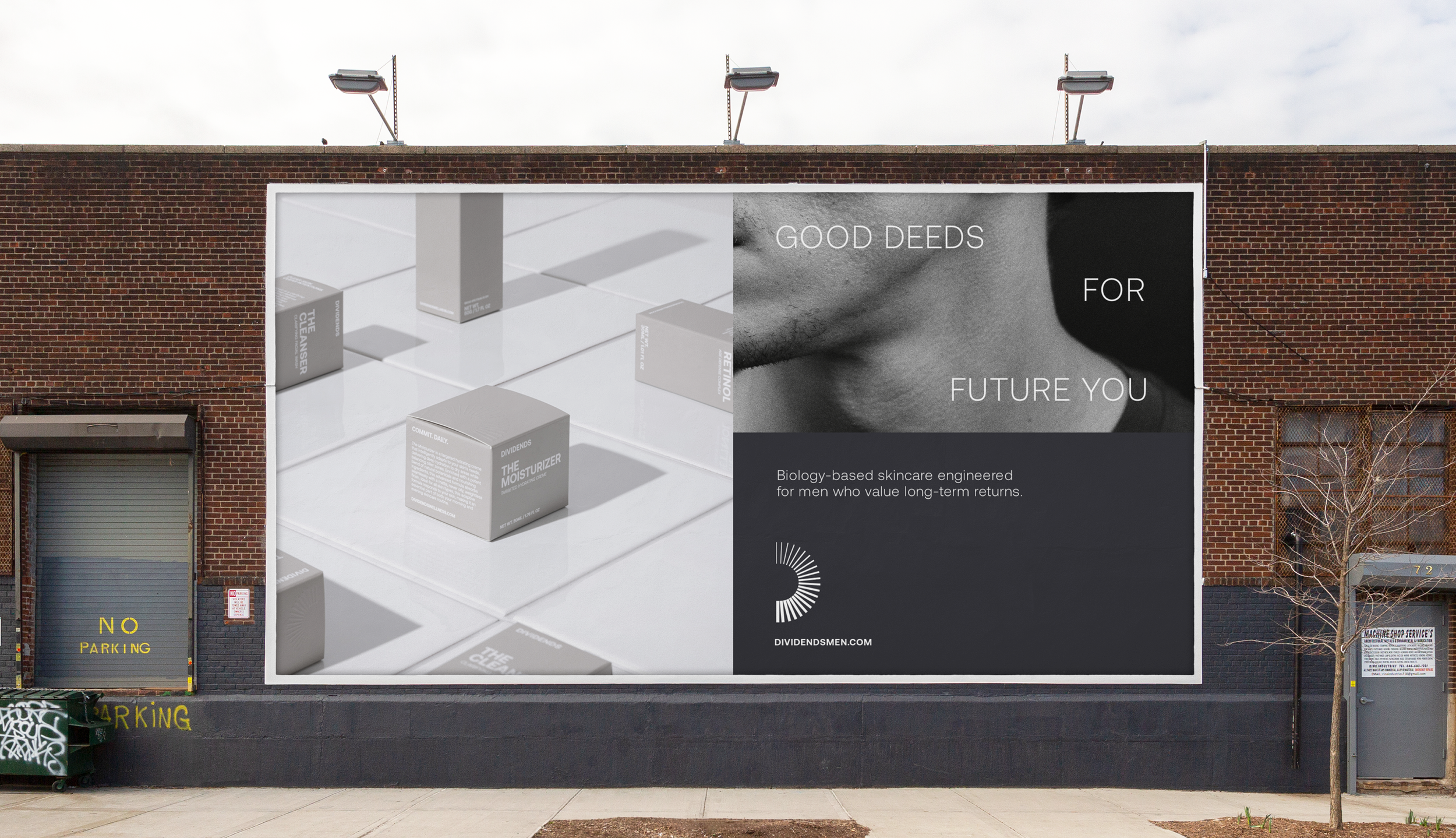
The brand is built on clarity and directness. The art direction for product photography needed to reflect this. A mixture of plain white surfaces, white tile, create contrast with the product and add context. Strong lighting adds a sense of clarity and immediacy to imagery.
It was important to build a brand not just around a product, but a lifestyle, grounding the products in place and context. Defining the DIVIDENDS man in the modern day whilst creating a brand language that spoke to the idea of future rewards.
Design & messaging
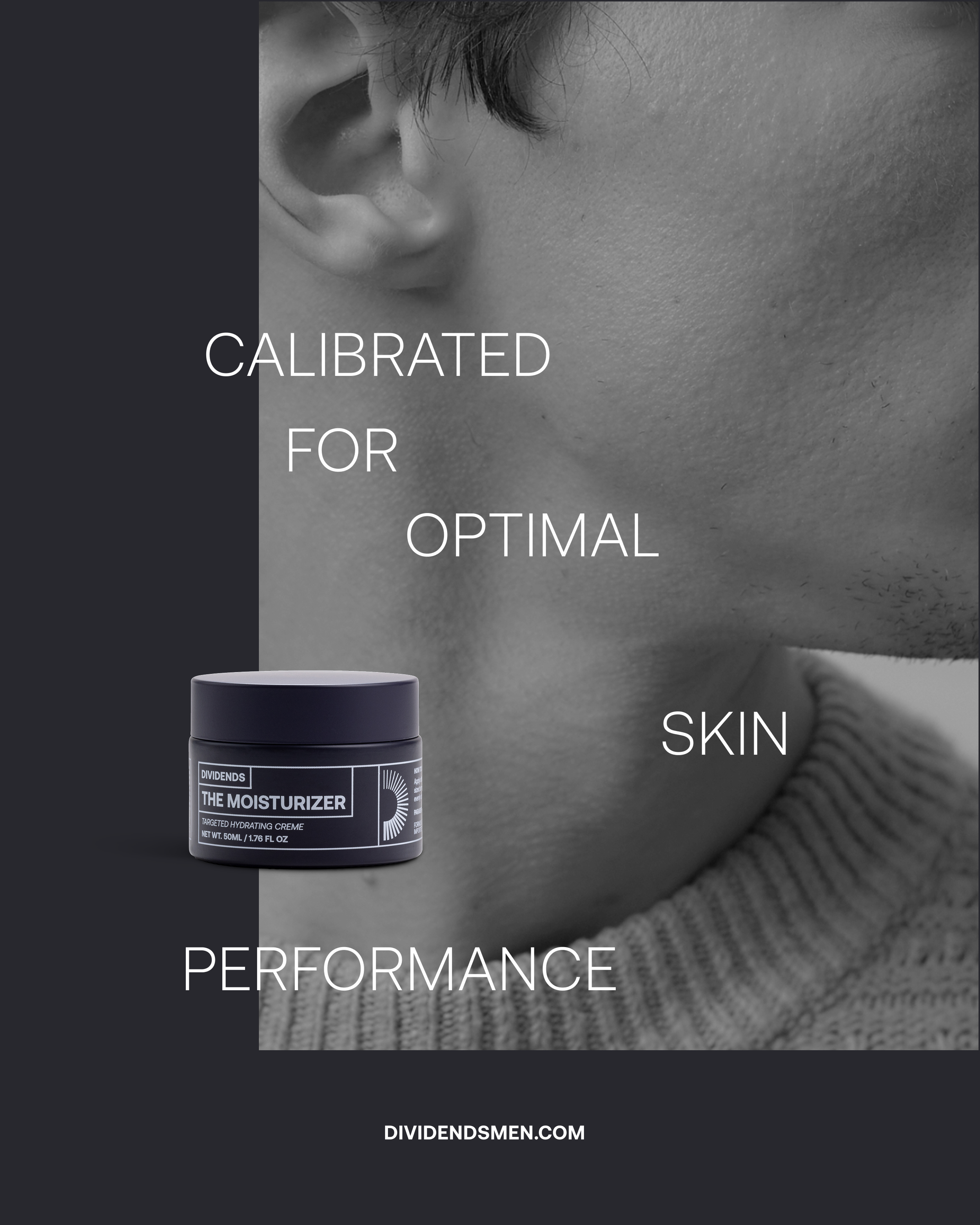
The design approach was fuelled by clarity and simplicity. A minimal type style and colour palette helps communicate the product’s usage and benefits without unnecessary distractions. The technical, science-backed approach of the brand is referenced with line-based iconography and illustration. Image overlays expand with each segment, visually referencing growth over time.
Tone of voice speaks to a future you. It encourages the audience to make good decisions now, so they can reap the rewards later.


Lifestyle Photography
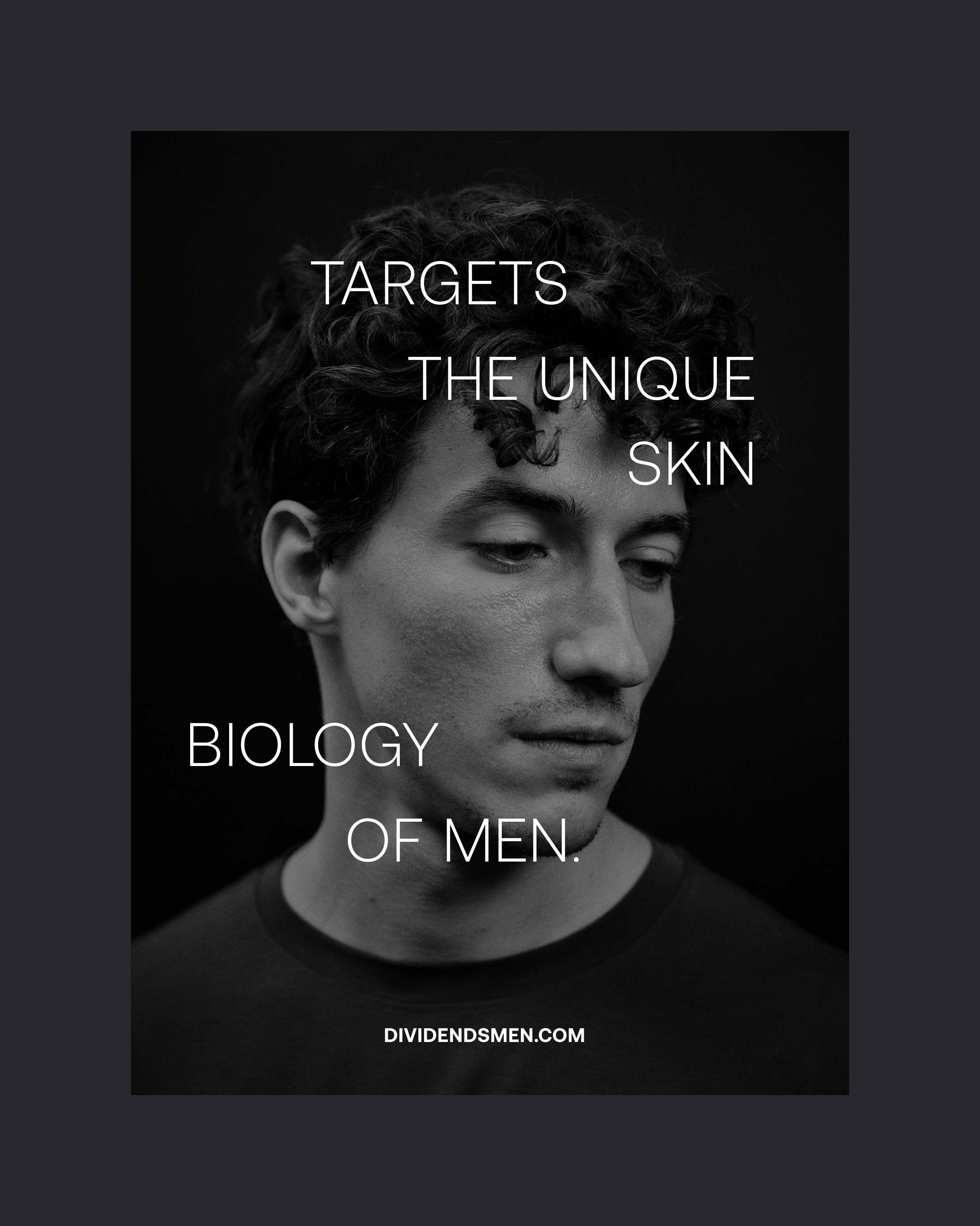
Lifestyle photography defines the DIVIENDS man visually. He is mature not macho, confident and modern. The purpose of the lifestyle photography is to create desire, context and relatability. This is achieved through a mixture of situational photography and close up skin focussed portraits.
The style has a natural, editorial tone, avoids feeling staged, and when close in, is skin focussed. Compositions tell stories, but are suggestive with their narratives: someone on a run indicative of a personal trainer. Suggestive, not literal. Creating intrigue and aspiration. The location, New York, the birthplace of the brand.
The brand name has built-in meaning, evoking wealth, return, and long-term gain. The brand leans into this and frames self-care as an investment.
Investment insights
Dividends reframes skincare as an investment. Good deeds for future you. This concept extends to delivering ‘investment insights’, using the product’s graphic elements to highlight key data and benefits.

DIVIDENDS is a new startup. A direct-to-consumer brand. Digital platforms are central to its growth. Attention was given to make customer engagement, and experience, informative and easy, whilst still feeling high-end and desirable.
View more work
Dividends
Biology based skincare for the future you.
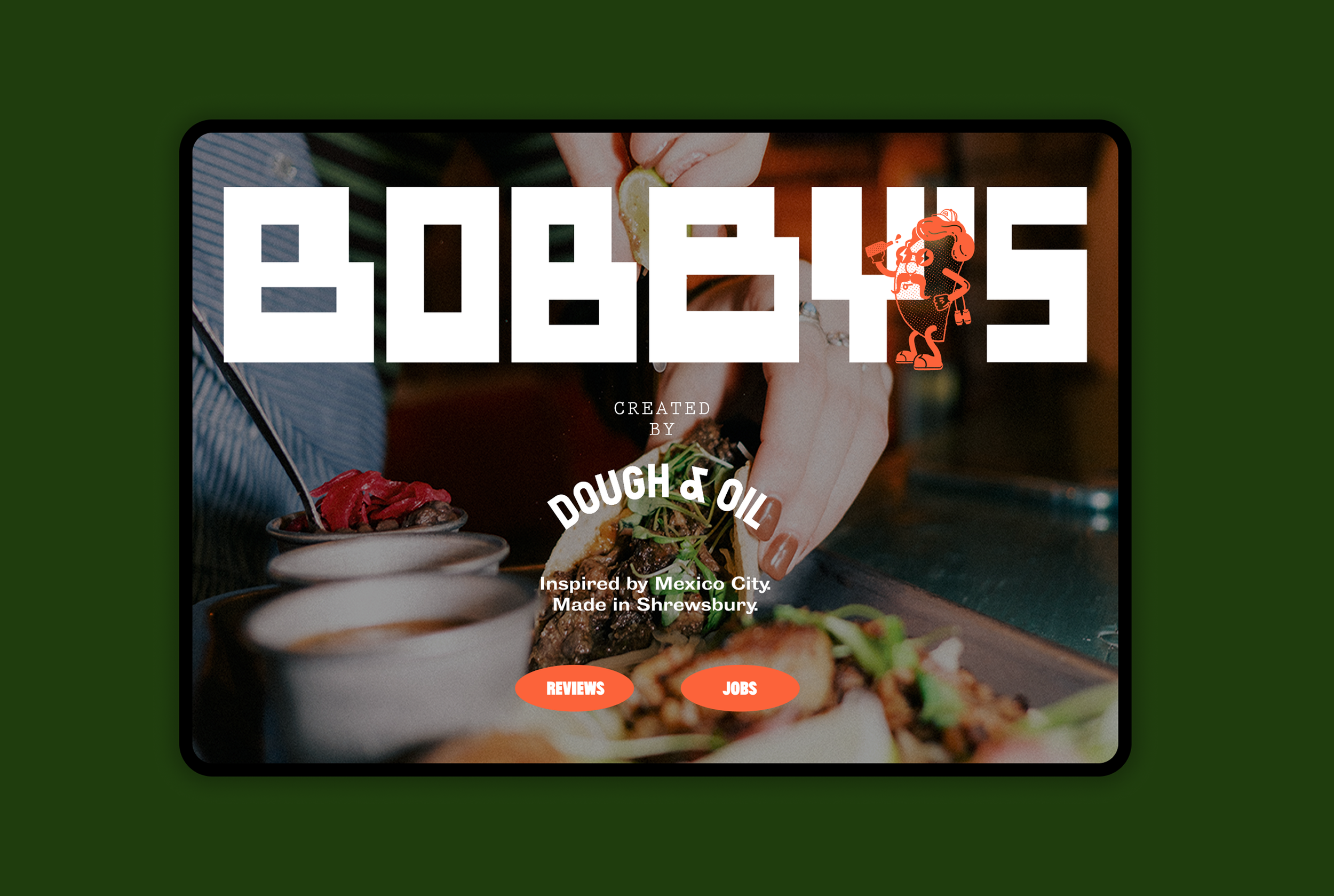
BOBBY’S
Inspired by Mexico. Made in Shrewsbury.

Croydon College
Empowering the next generation of students.
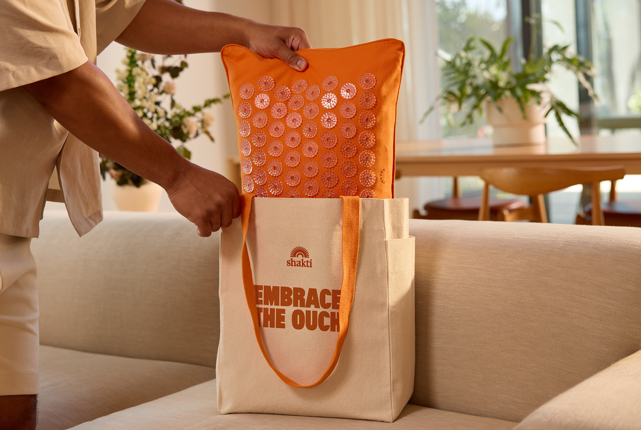
Shakti
Ancient wisdom. Modern Relief.
Foxe & Fable
Luxury underwear designed to be desired.

HardCOPY
A new publication for bold voices.