Shakti
Shakti have been quietly leading the way in acupressure for nearly two decades, yet their brand lacked strategic direction and a coherent design language. With the founder and global stakeholders spread across multiple markets they needed a new brand that could unite them and enable growth.
Strategy
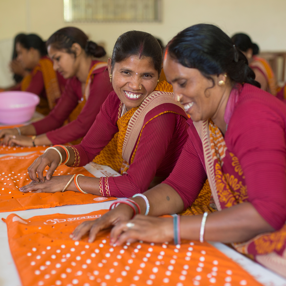
India is the birthplace of acupressure; a wellness practice that stems back thousands of years. It’s where Shakti’s founder lives, where their products are made, and where their brand has a positive social impact.
The strategic concept of "Indian Enlightenment" was developed to celebrate Shakti’s origins, whilst educating a new audience on how acupressure can alleviate issues derived from modern living.
Logo
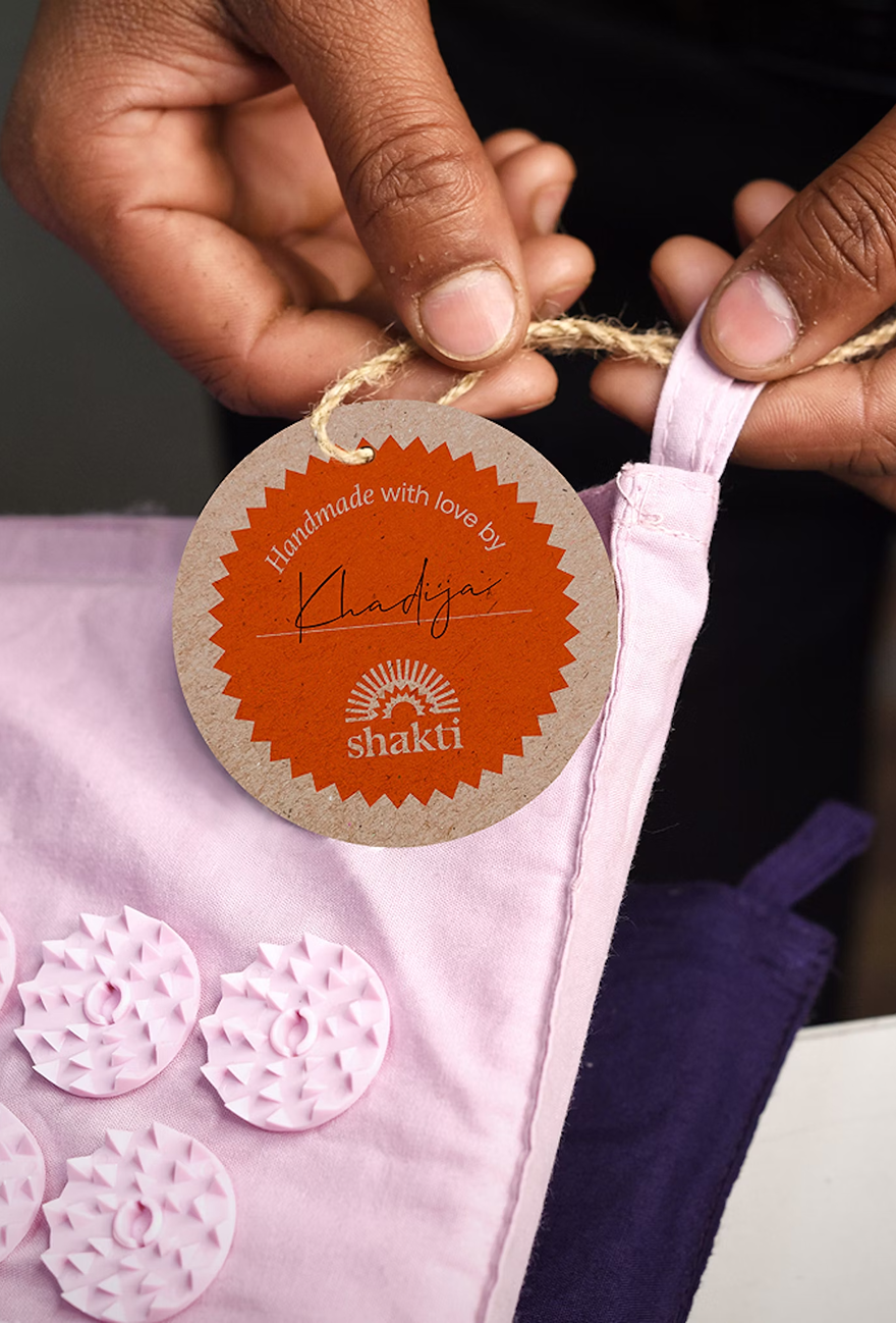
The Shakti logo is a symbol of renewal. The combination of the spikes and half sun represent the beginning of a new journey into the world of acupressure.
Crafted and then hand stamped, the logo finds a balance between artisanal and contemporary. It represents the craft of every product made in India, whilst referencing the core principle of acupressure: applying pressure.
The core brand elements needed to strike a balance that allowed Shakti to communicate their rich heritage while appealing to a modern audience.
Graphic language
The headline font embodies the brand’s personality traits: it’s bold, modern and full of character. It amplifies their voice and allows them to communicate the fun and playful aspects of acupressure. The supporting typography is more delicate. It can combine in a more poetic way to tell short stories about people, rituals, social impact or benefits of an acupressure practice.
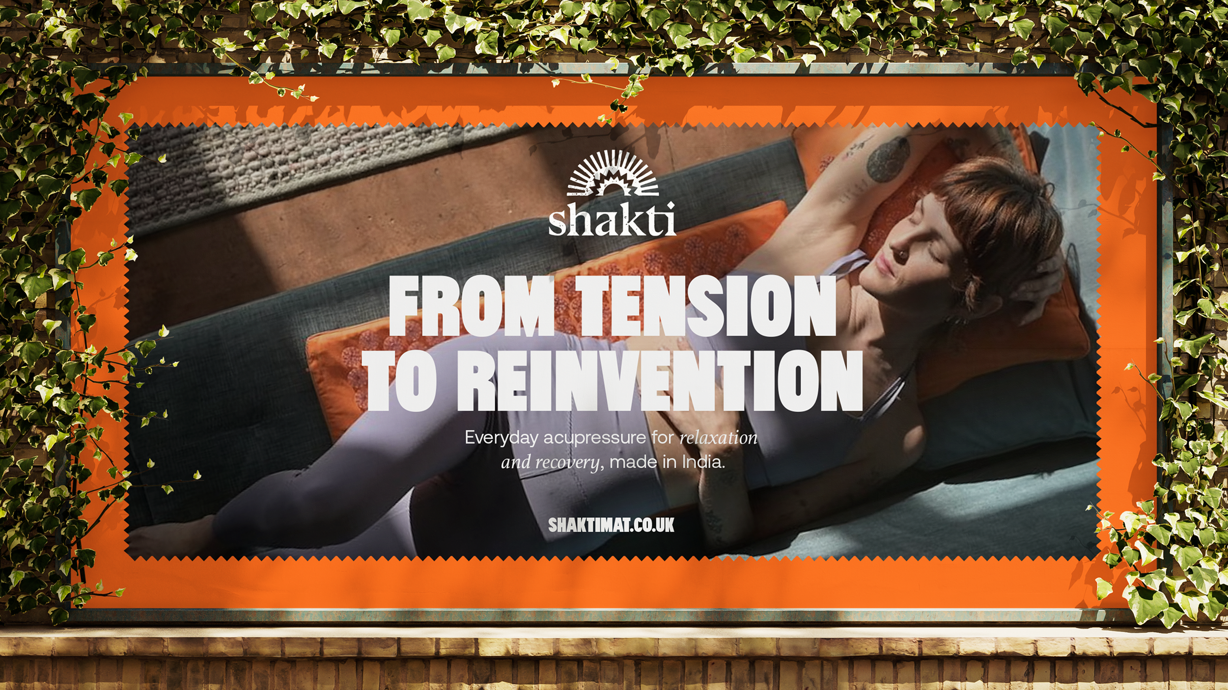
Photography & Colour
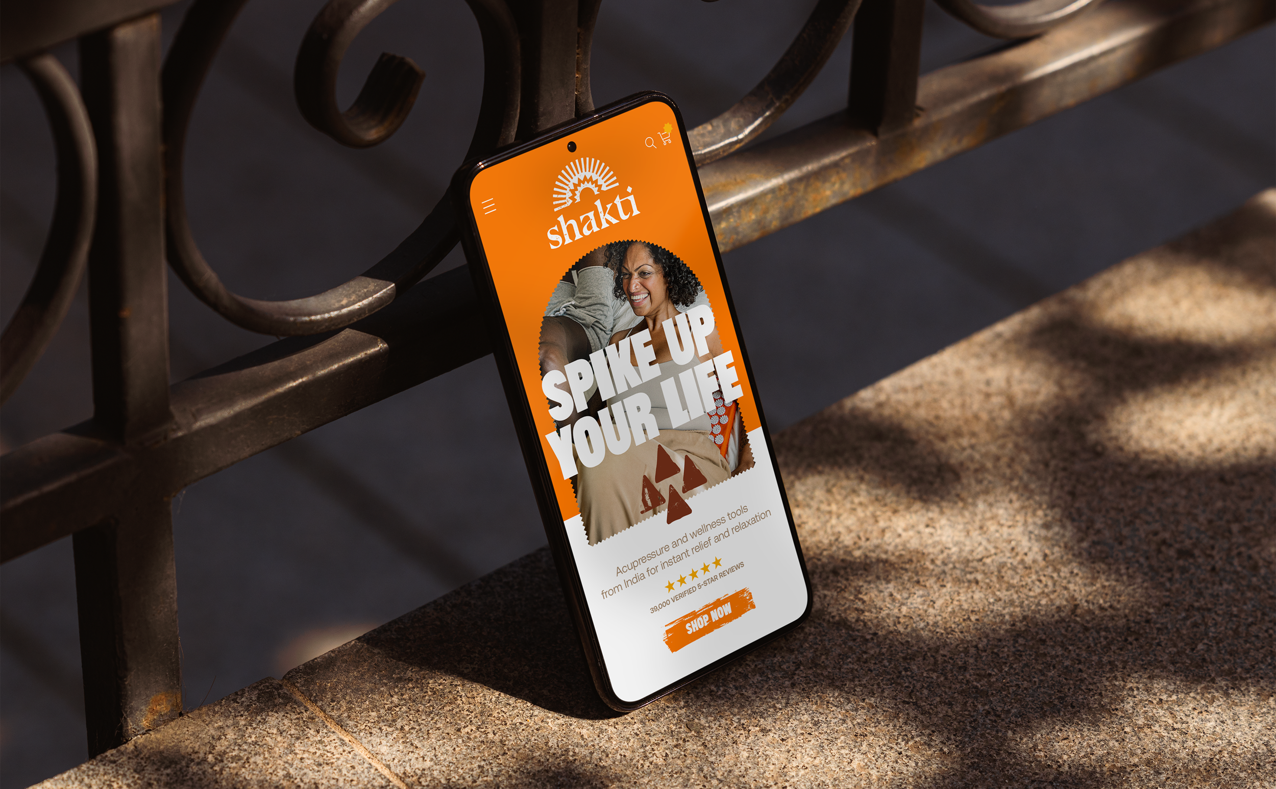
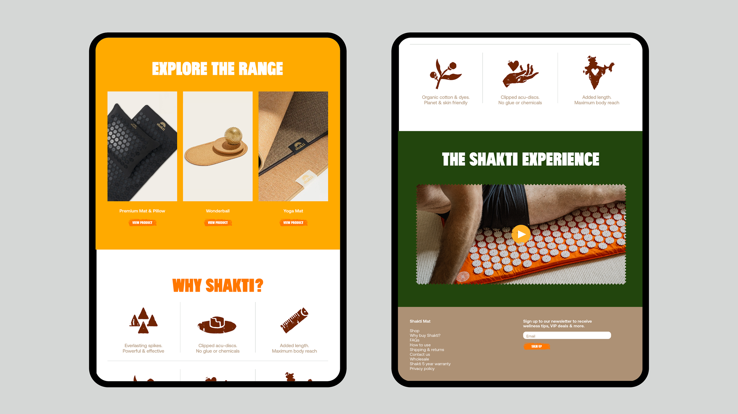
Photography plays a key role in communicating Shakti’s heritage whilst placing their products in the modern world of wellness. The refreshed brand imagery steps away from the stereotypical aesthetic of yoga and spiritualism to a more modern, diverse and inclusive style.
Core imagery uses natural light and shadow to create sensitive and evocative images communicating a feeling of calm whilst showcasing a personal acupressure practice. Nostalgic textured supporting imagery communicates the brand’s Indian roots – bringing a sense of place, people and purpose.
Colour further plays a role in referencing India’s rich heritage with colours being inspired by nature, architecture and culture.
The rebrand celebrates Shakti’s unorthodox approach that pain leads to feeling good, and leans in to the quirkiness of Shakti’s products through a playful, vibrant and energetic verbal and visual language.
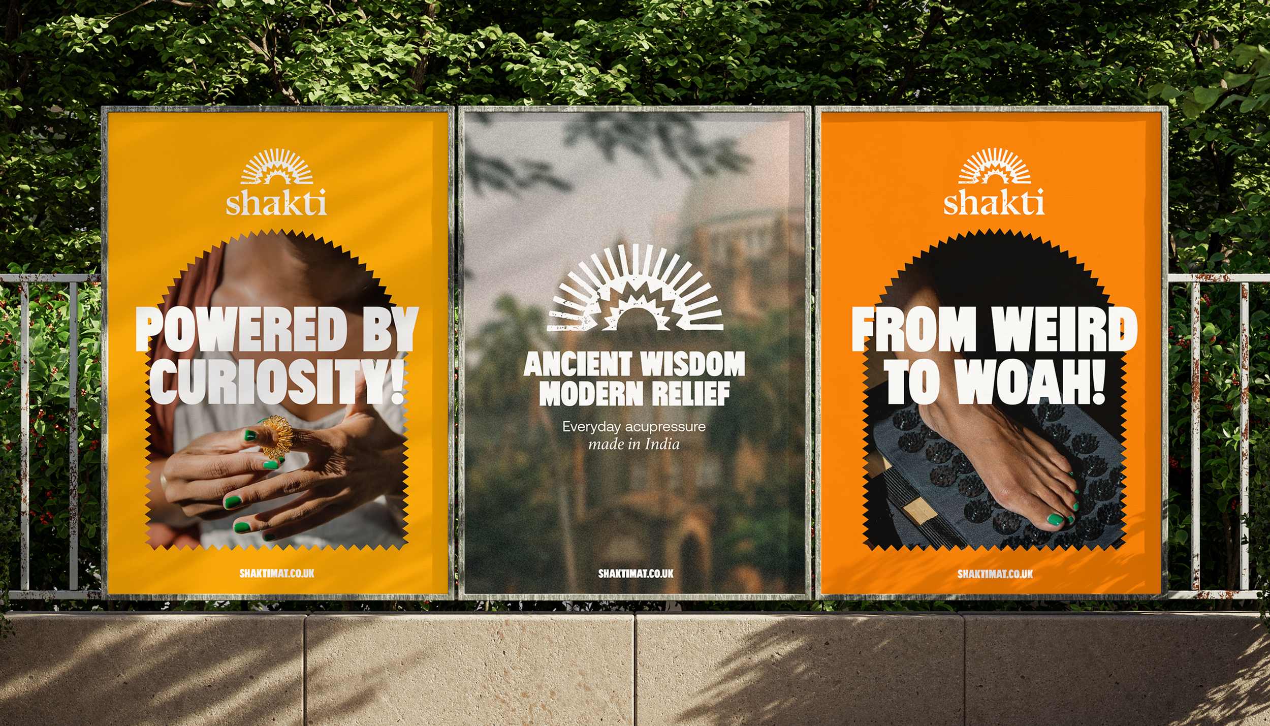
Tone of voice
The process of acupressure is not an immediately obvious antidote to discomfort. Lying on spikes is weird and the brand tone of voice leans into this aspect. Allowing them to be be a little weird through their storytelling. Messaging is not laugh-out-loud funny, but quirky irreverence that makes you think and smile.

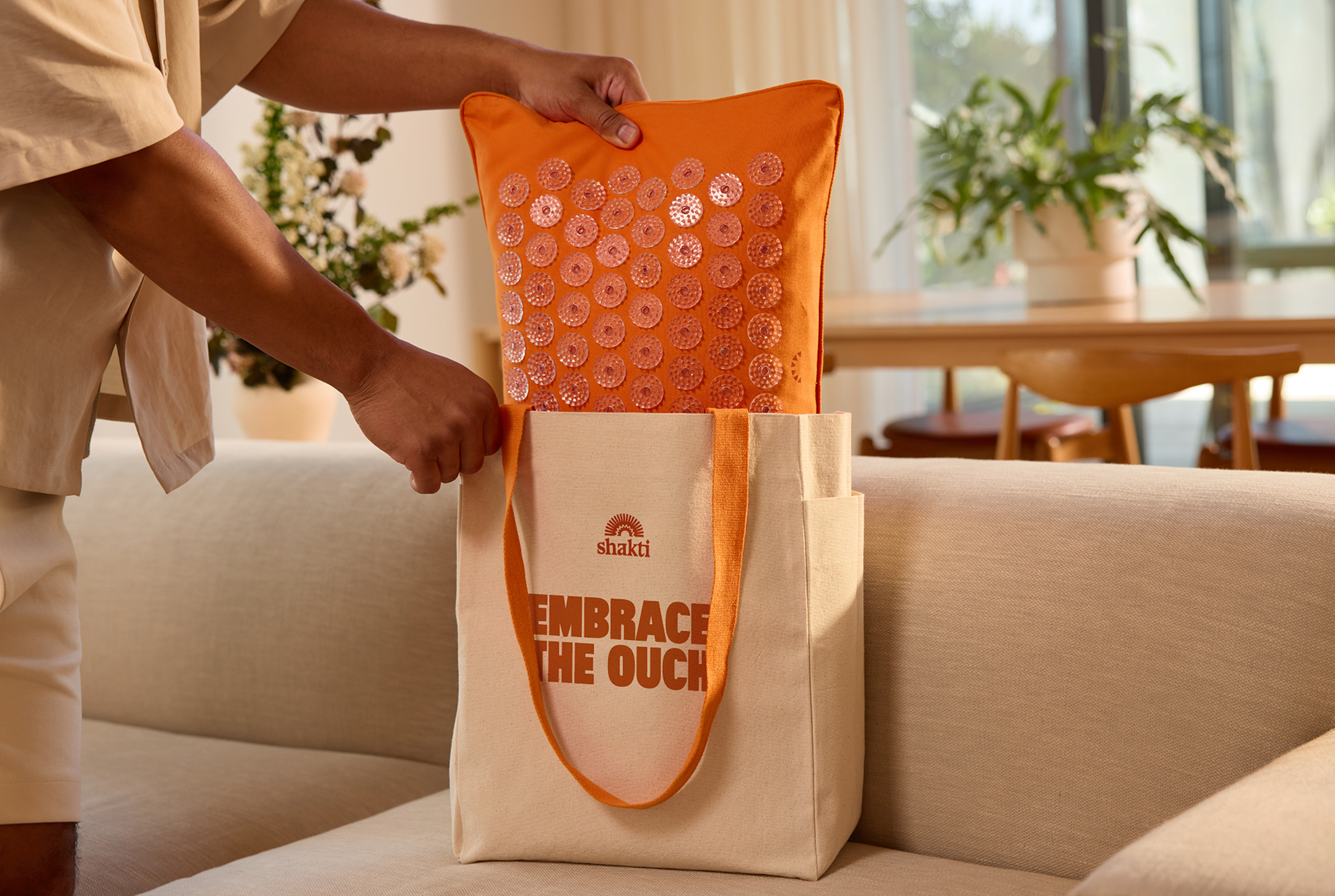
Spikes & Illustration
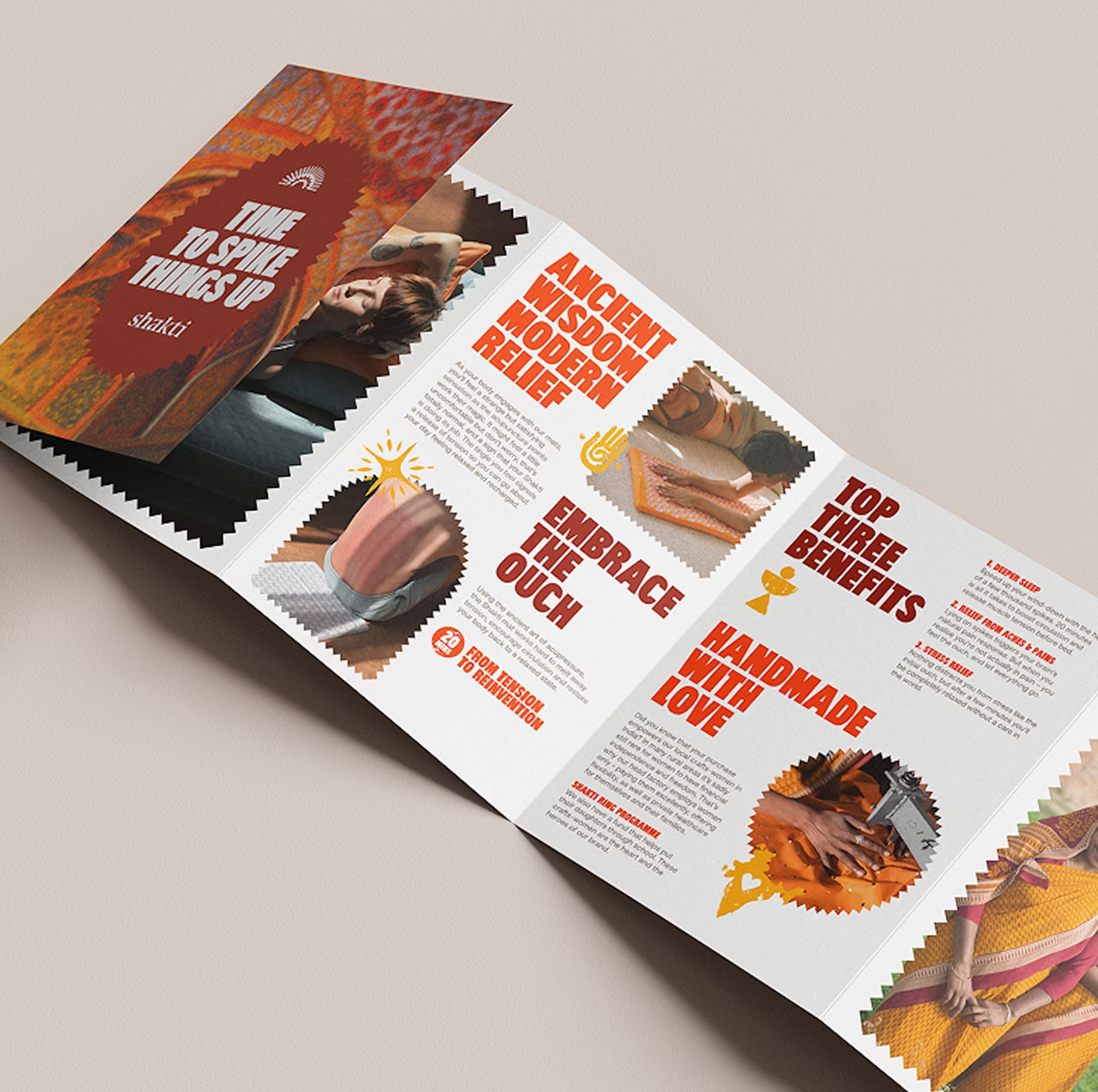
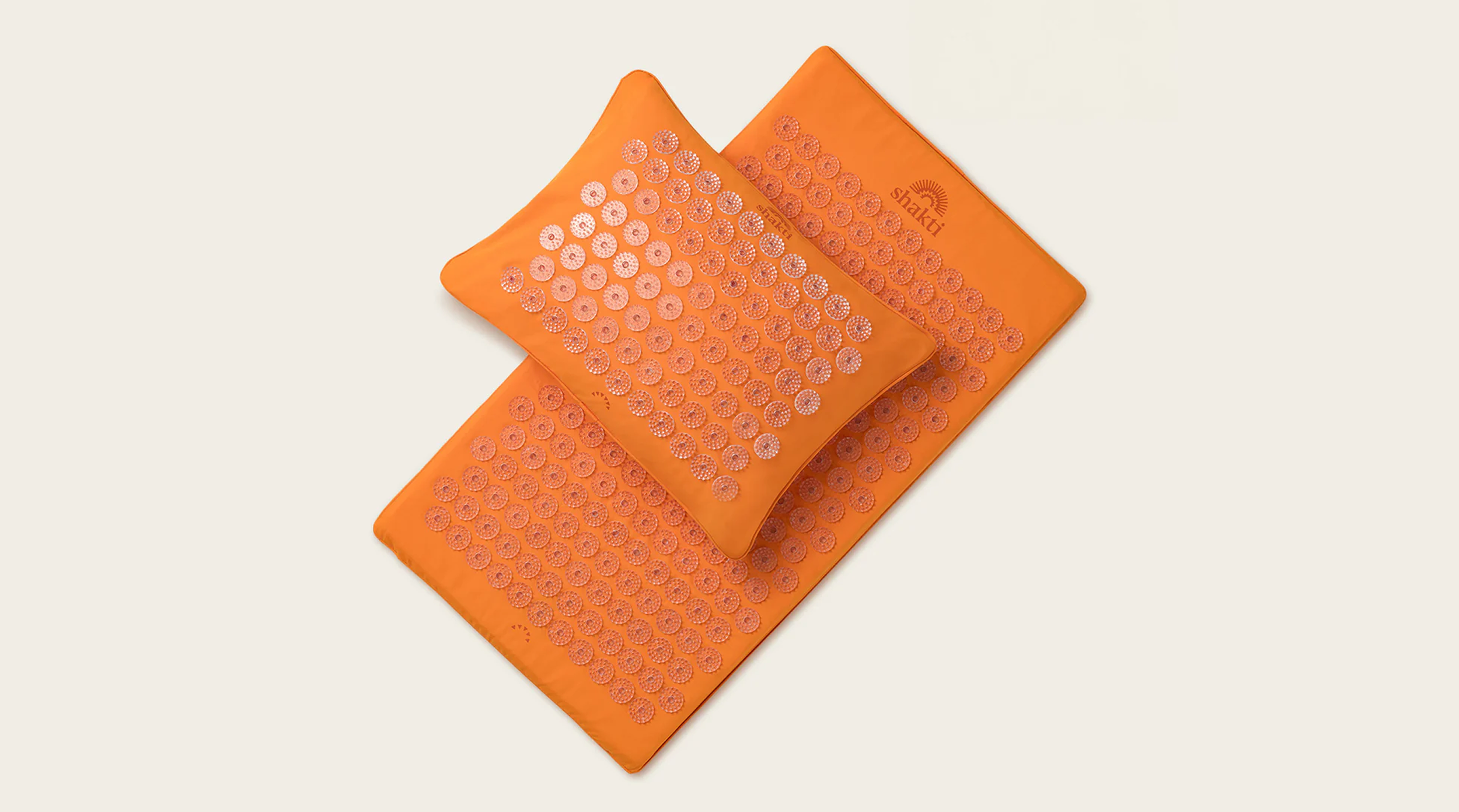
All of Shakti’s acupressure products deliver relaxation and recovery through some form of spike. They ask their customers to ‘embrace the ouch’, an idea that the brand echos.
Spikes are a prominent feature in brand language, masking imagery and housing stats and info.
Supporting illustration takes on a wood block aesthetic further utilising the idea of applied pressure. It is used to communicate the benefits of acupressure in a playful way, whilst avoiding any bold scientific claims.
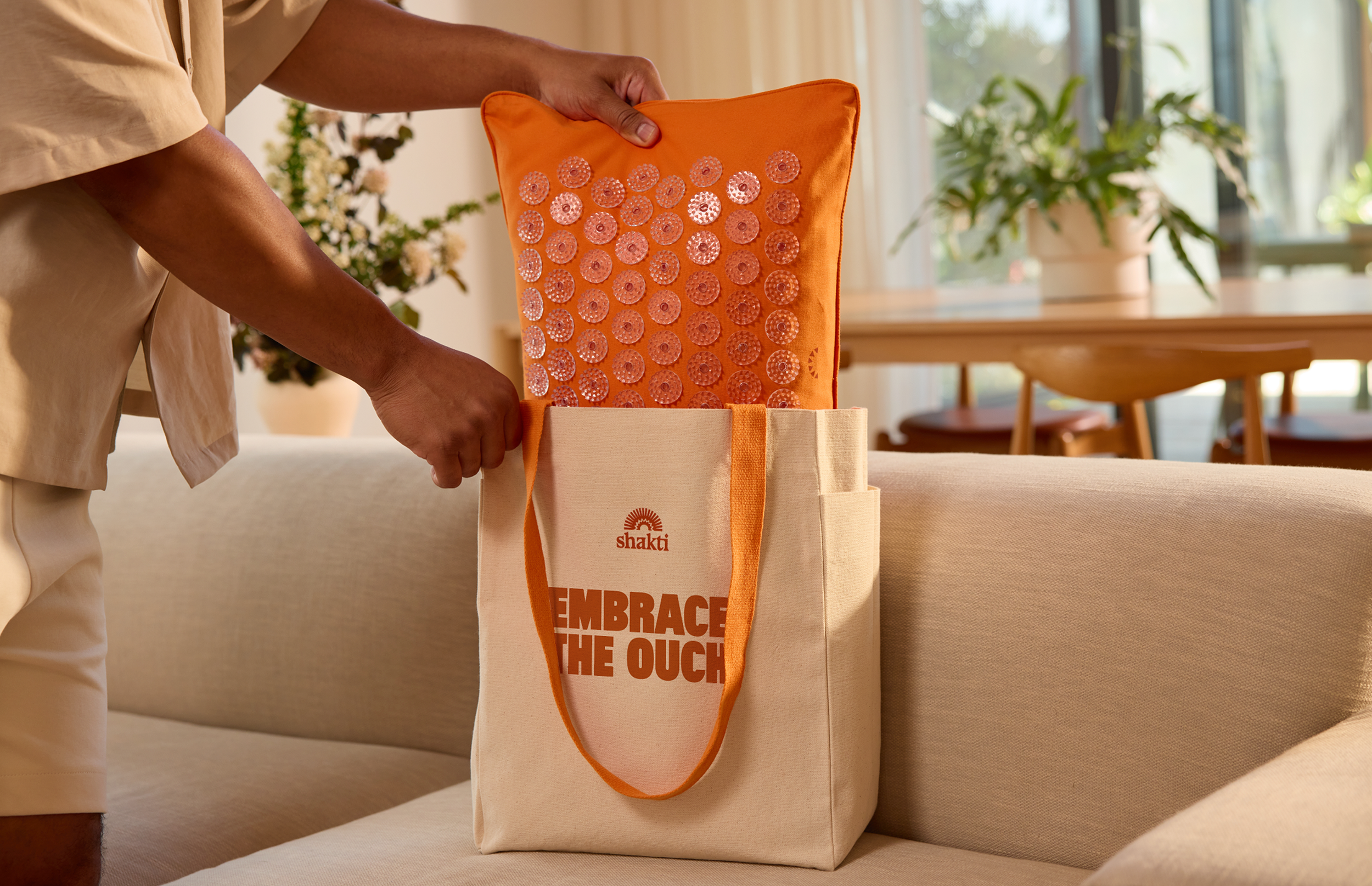
Shakti’s products are industry leading. They are pioneers within this space. The identity had to work across many applications and production techniques. Packaging had to be more than a box, delivering products that kickstart a customer’s journey into the world of acupressure.
Packaging
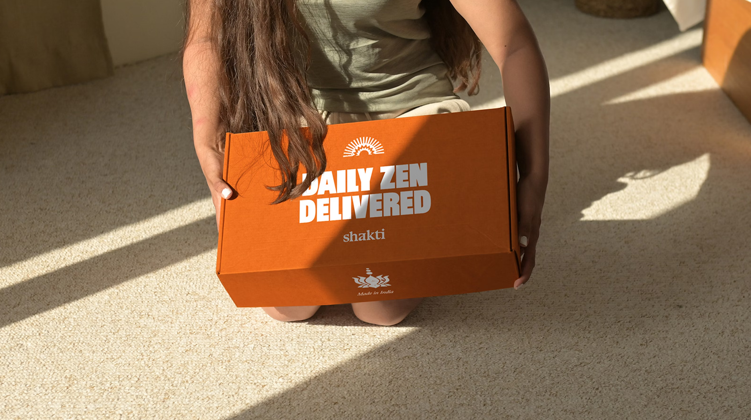
Packaging is an extension of the brand and their products. Products are delivered with an element of playfulness and fun, with the use of bold messaging and supporting illustration.
Production
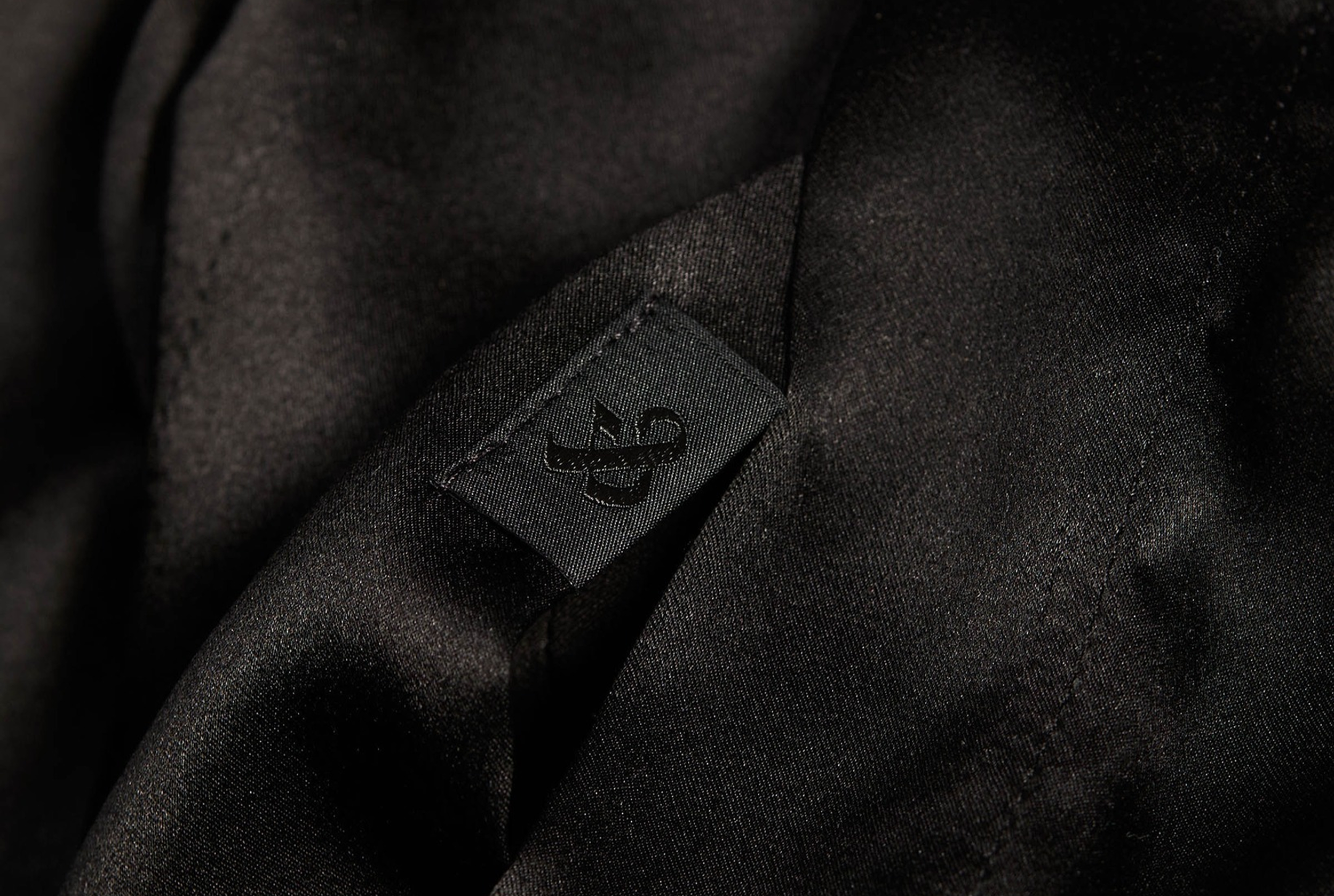
The brand logo needed flexibility to work across multiple production processes from silkscreen to embroidery. To achieve this, a solid version of the logo was supplied alongside the master textured version to support the application of more delicate production techniques.

Shakti are an e-commerce, direct to consumer brand, making it pivotal that the new identity worked across all digital platforms. The storytelling possibilities of social media were harnessed to highlight Shaki’s invaluable social impact work and its product’s key benefits.
Social impact
In many rural areas in India, it’s sadly still rare for women to have financial independence and freedom. That’s why Shakti’s head factory employs women only - paying them a fair wage, offering flexibility, as well as private healthcare for them and their families. They also have a fund that helps put their daughters through school ‘Shakti Rising’.
The new brand book was key to the rebrand’s success. With stakeholders across six continents it enabled a fragmented team to be united under a common brand language.
View more work
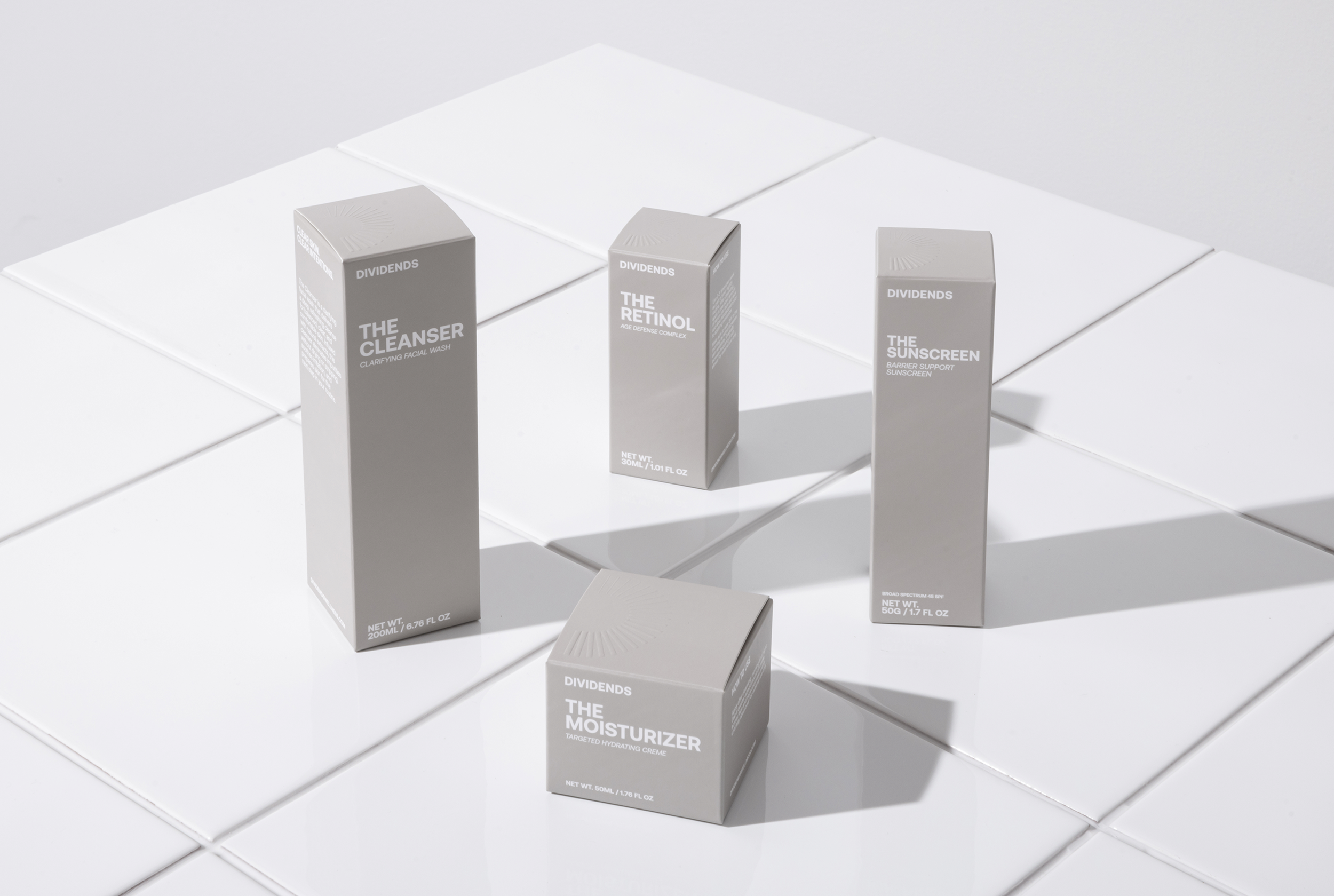
Dividends
Biology based skincare for the future you.
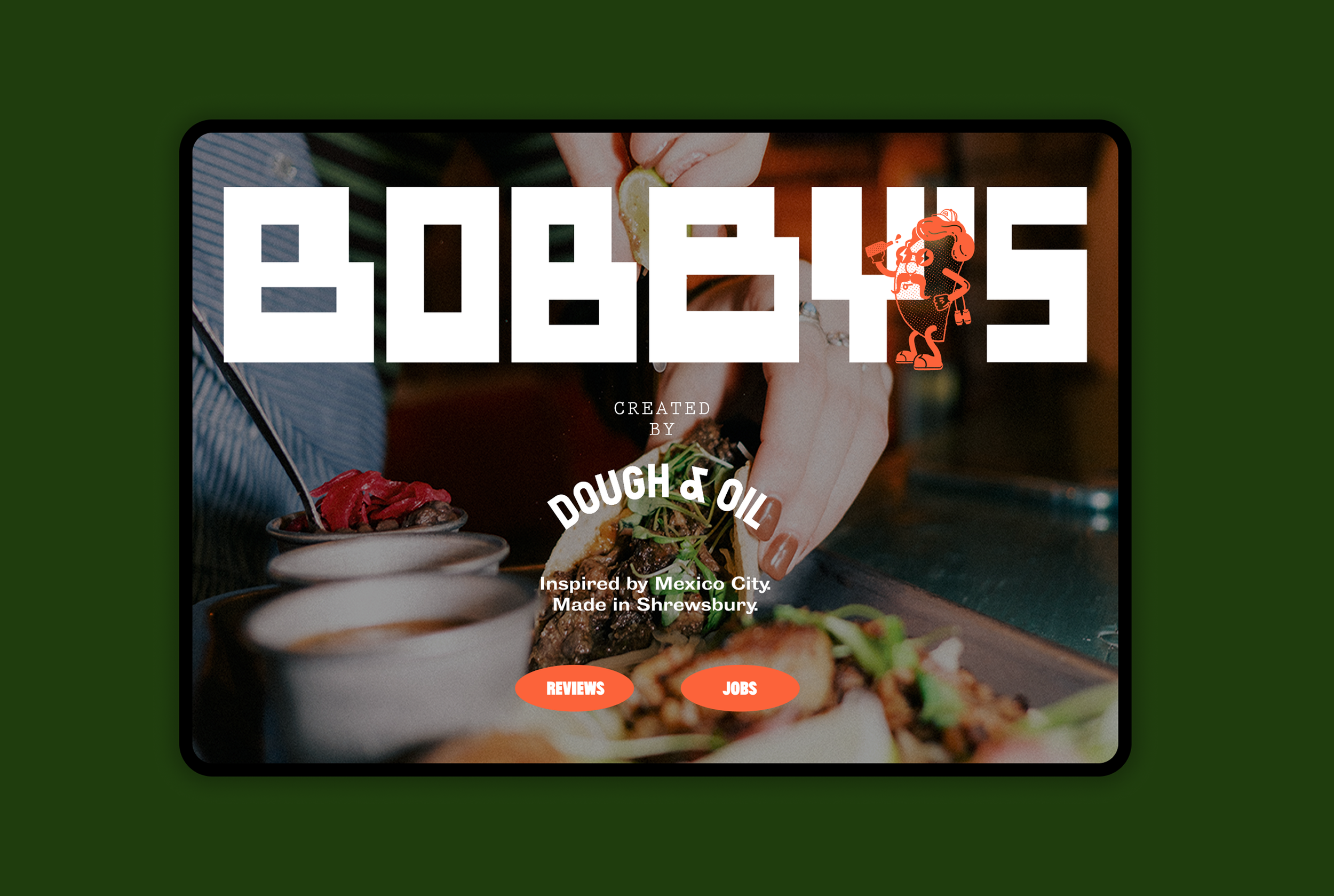
BOBBY’S
Inspired by Mexico. Made in Shrewsbury.

Croydon College
Empowering the next generation of students.
Shakti
Ancient wisdom. Modern Relief.
Foxe & Fable
Luxury underwear designed to be desired.

HardCOPY
A new publication for bold voices.