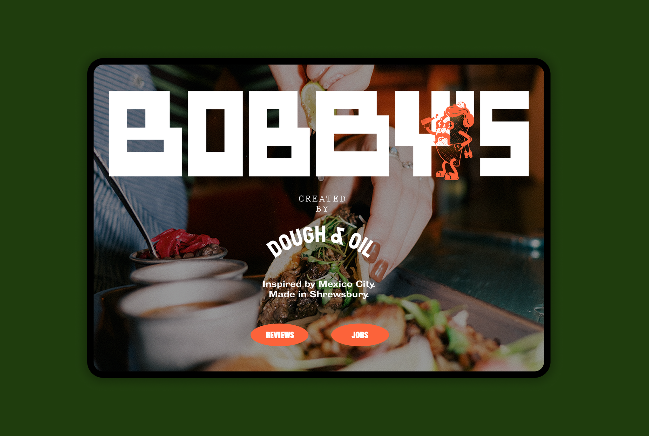
BOBBY’S
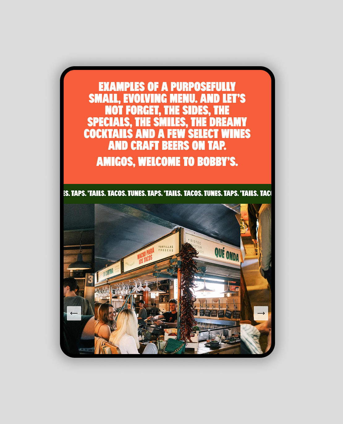
A short trip to Mexico City and an opportunity to breathe new life into a once iconic location, Bobby’s was born. Salvaged materials, bare brick walls, a cosy kitchen and outdoor terrace combine with a purposefully small, evolving menu.

Strategy
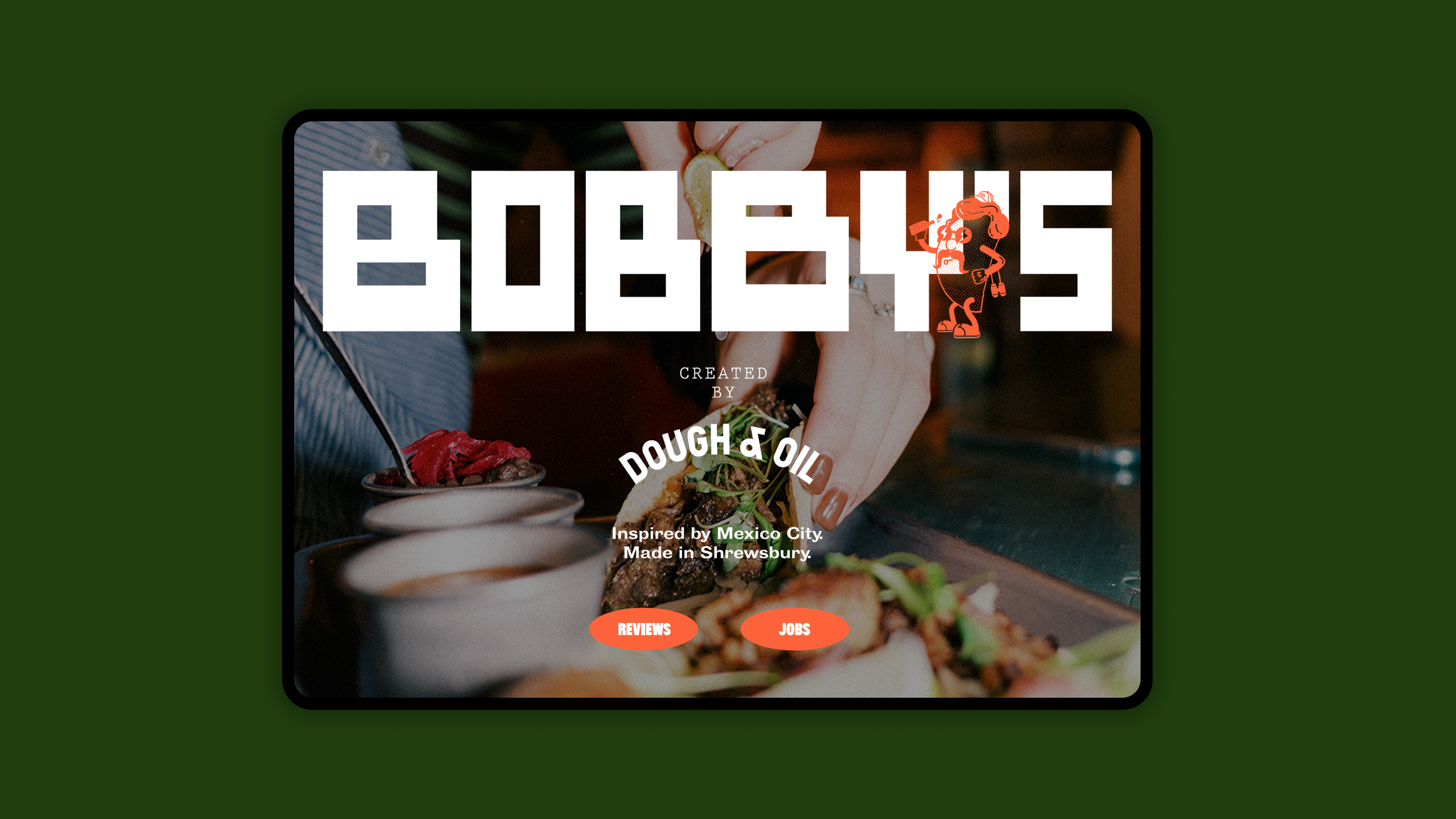
Inspired by Mexico. Made in Shrewsbury. The brand idea blends Mexican spirit with local roots. It captures the energy and vibrancy of Mexico and the hands-on pop-up approach.
Logo
Inspired by found and reclaimed materials. A hand built, imperfect aesthetic. It’s bold, primitive and unexpected, the perfect match for Bobby’s.
It was important to strike a balance between Mexico and a city-style, urban restaurant in Shrewsbury, whilst honouring the hands on approach of the team.
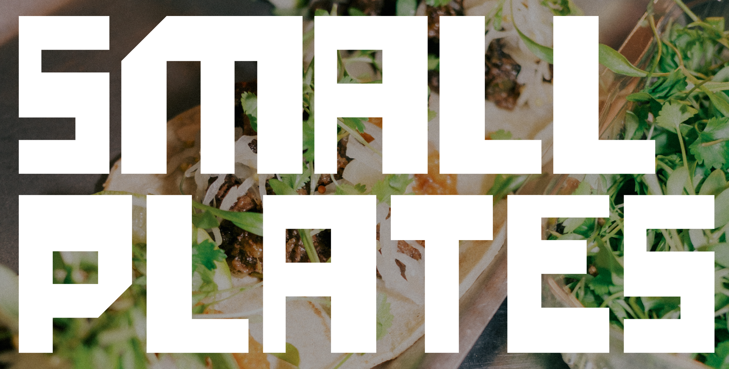
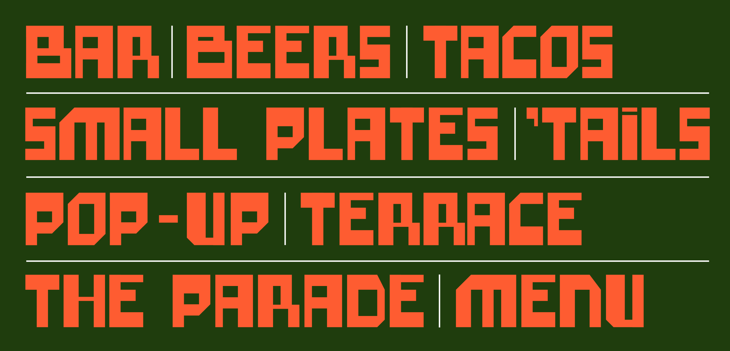
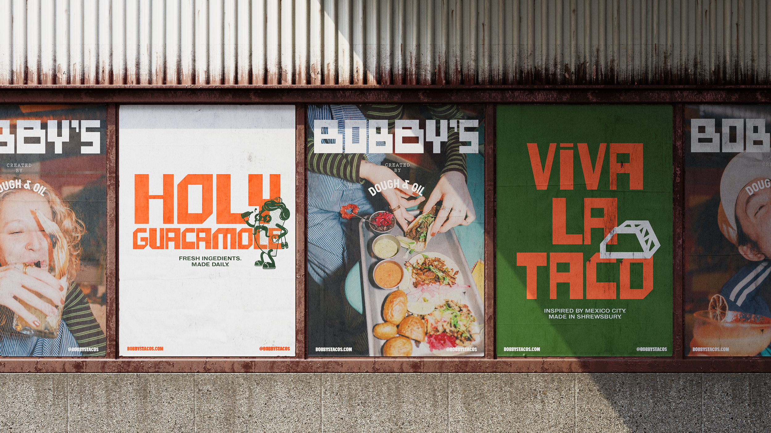
Graphic language
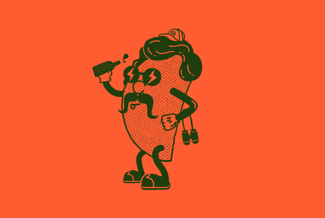
A custom font was created, building on the design of the logo. Mexico seemed the obvious choice for colour inspiration whilst the handmade aesthetic was further carried through the design of iconography. To complete the graphic language a supporting taco character was created: a design feature borrowed over from the teams other venture: Dough & Oil.
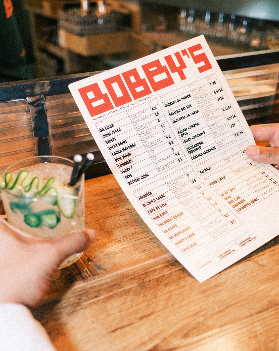
Photography
Energetic and high contrast photography captures candid moments of both guests and staff, building a friendly, welcoming vibe.

Digital
A simple single page site and social media assets are a window into life at Bobby’s. Telling their story though fun and playful messaging combined with vibrant and playful photography.
View more work
Dividends
Biology based skincare for the future you.
BOBBY’S
Inspired by Mexico. Made in Shrewsbury.

Croydon College
Empowering the next generation of students.
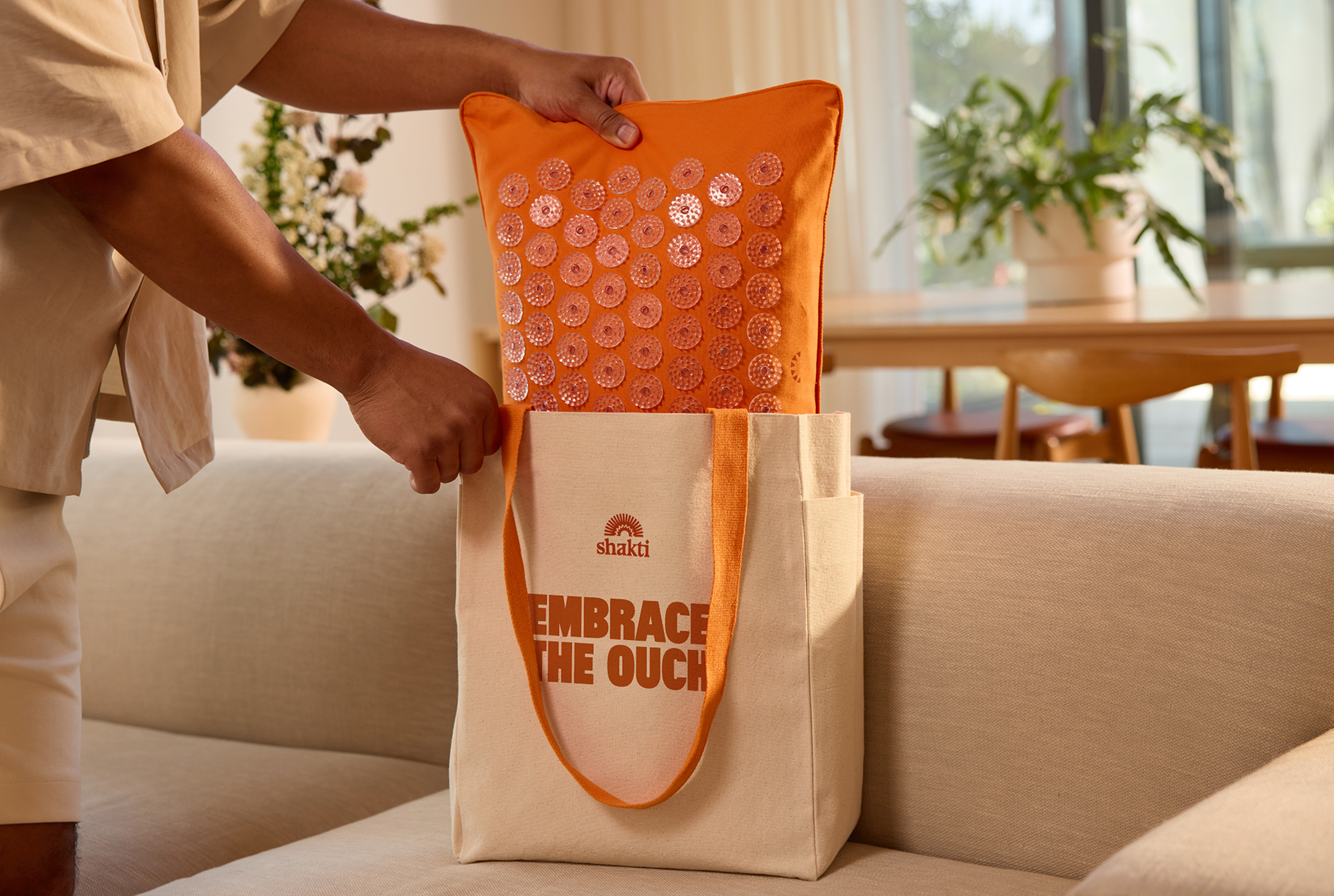
Shakti
Ancient wisdom. Modern Relief.
Foxe & Fable
Luxury underwear designed to be desired.

HardCOPY
A new publication for bold voices.